وَجـيـه للتغليف
Wajih Packaging
Wajih is a creative agency specialized in designing custom packaging for Saudi cultural and economic products, characterized by innovative designs that reflect the quality of products. We aim to upgrade Saudi designs to match the “Made in Saudi Arabia” initiative to stimulate national industries.)
وَجـيـه هي وكالة ابداعية متخصصة في تصميم التغليف المخصص للمنتجات السعودية الثقافية الأقتصادية ، تتميز بتصاميم مبتكرة تعكس جودة المنتجات. تهدف إلى بالارتقاء بالتصاميم السعودية لتتناسب مع مبادرة صنع بالسعودية لتحفيز الصناعات الوطنية.

Naming
التسمية
تم اختيار الأسم لتناسبه مع التعبير العامي المتداول عند وصف الشي الجيد والقيم “يــواجــه”.
ذو قيمة ، حسن ومقبول، مَرْمُوق.
"Wajih"The name was chosen to align with the colloquial expression used to describe something good and valuable.It conveys with, quality, and high regard.
Logotype
الشعار


يعكس الشعار الرسمية حيث تتميز الحروف بالثبات والرزانة من خلال الخطوط السميكة والترويسات الحادة. وتم تشكيل النقطة لتمثل طرف الورق لتعكس الخامات المستخدمة
The logo reflects formality, characterized by stable and dignified letters through thick lines and sharp headings. The dot is designed to represent the edge of the paper, reflecting the materials used.
 |  |  |
|---|---|---|
 |

Visual identity elements and colors
العناصر وألوان الهوية البصرية
Packaging Design models for Saudi products
تـصمـيـم نماذج تغليف منتجات سعودية
Selected products (Khawlani coffee,Ajwa dates, olive oil) were chosen with different concepts and materials to showcase the diversity of the project's outputs.
تم اختيار منتجات مختارة (بن خولاني ، عجوة المدينة ، زيت زيتون) بمفاهيم وخامات مختلفة لعرض تنوع لمخرجات المشروع.


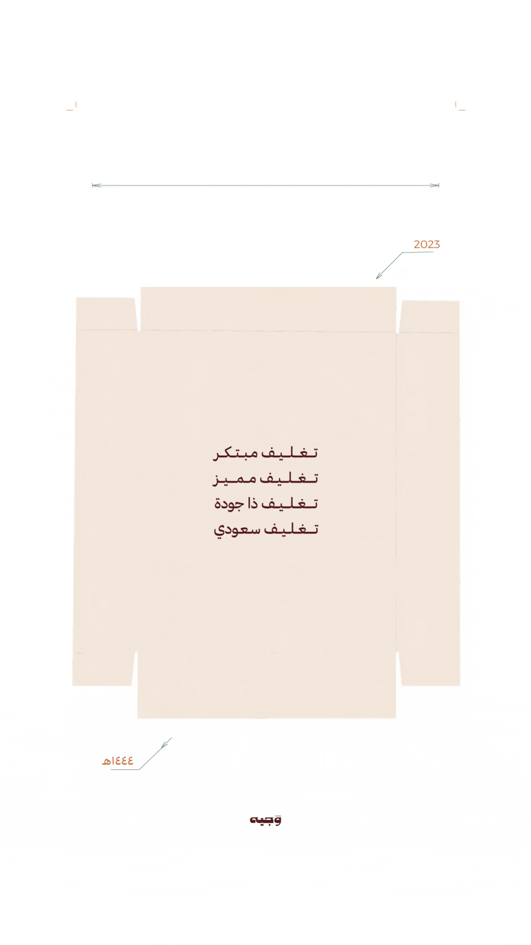
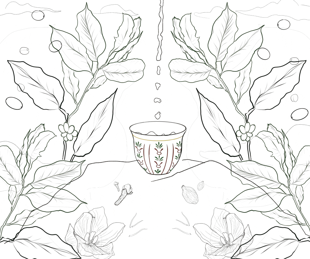
Packaging design for Khawlani coffee

تصميم تغليف لقهوة البن الخولاني
صندوق كرتوني يحوي على علبة القهوة من المعدن وبطاقة تحوي على معلومات إثرائية عن المنتج ومراحله.الواجهة الرئيسية للصندوق تحوي تصميم لرسومات مرسومة رقمياً بخاصية الطبقات لتمثيل مفهوم “من البذرة للفنجال”
A cardboard box containing a metal coffee can and a card with informative details about the product and its stages. The front of the box showcases a layered illustration design that illustrates the concept of "from seed to cup."
Sketches
الرسومات الأولية


تم اختيار الألوان والخطوط مستلهمة من بيئة البن الخولاني، حيث تعكس الألوان الدافئة والتدرجات الأرضية جمال الطبيعة المحيطة بزراعة البن. الخطوط المستخدمة تجمع بين الأصالة والحداثة، مما يعكس التراث الثقافي الغني لمنطقة البن الخولاني.
The colors and fonts were chosen inspired by the environment of Kholani coffee, where warm colors and earthy gradients reflect the beauty of the nature surrounding coffee cultivation. The fonts used combine authenticity and modernity, reflecting the rich cultural heritage of the Kholani coffee region.

Final Drawing
الرسمة النهائية

Promotional Video
الفيديو الترويجي

Label Design
تصميم الملصق

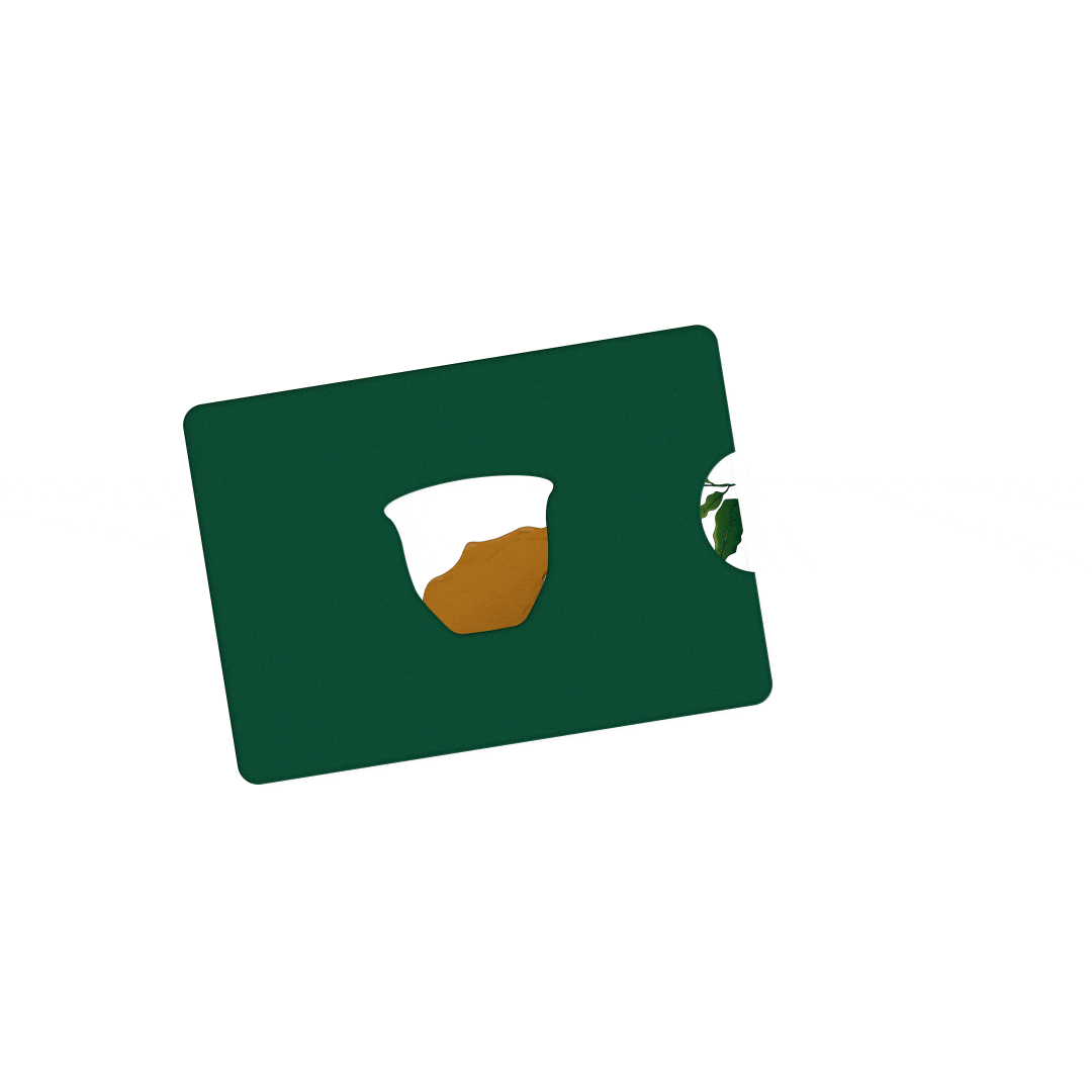

Card Design
تصميم البطاقة


Packaging design for Ajwa dates
تصميم تغليف لتمر العجوة
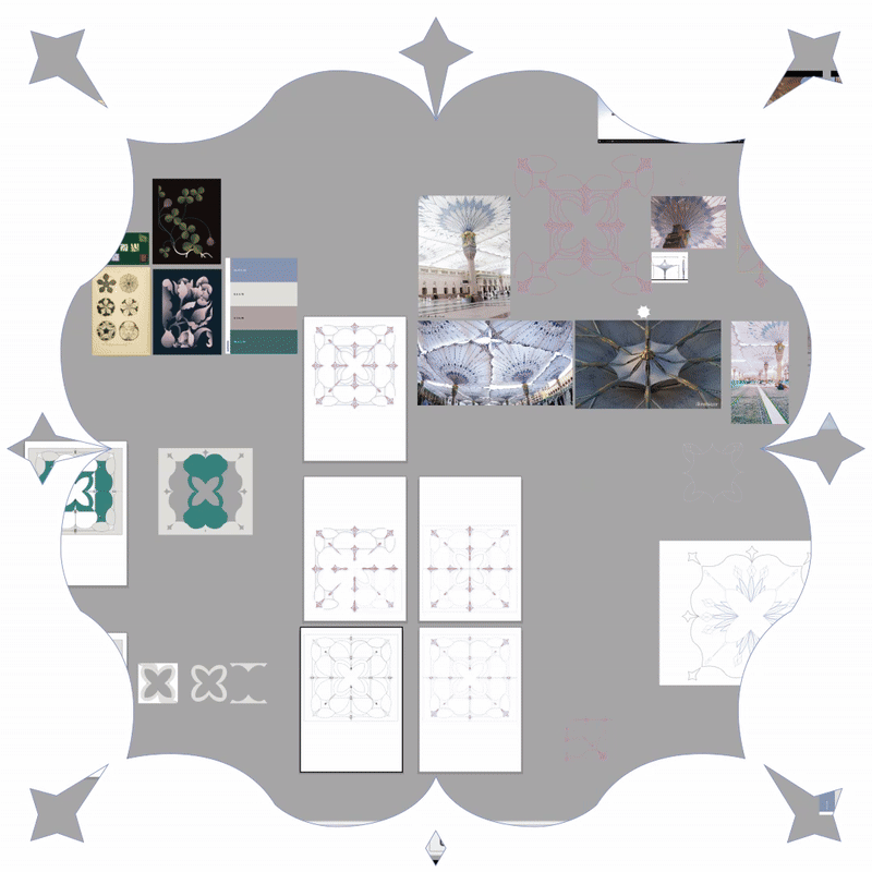
التصميم مستلهم من نقوش مظلات المسجد النبوي وعناصره ليكون التغليف يمثل مفهوم “رحلة إلى المدينة”.تم تقسيم التمرات على 7 بكل علبة لما ذكر في حديث النبي صلى الله عليه وسلم: (من تصّبح بسبع تمرات من عجوة المدينة لم يضره سٌّم ولا سحر)حديث صحيح. التصاميم مستلهمه من اشكال ونقوش المظلة الموجودة بالحرم النبوي ، لكون المظلة مقصدها هو حماية المصلين للتوافق مع فائدة تمر العجوة لحماية المسلم.
A packaging design for Medina Ajwa dates, inspired by the patterns and elements of the umbrellas in the Prophet's Mosque, representing a "Journey to Medina" The dates are divided into groups of seven in each box, as mentioned in the Hadith of the Prophet Muhammad (peace be upon him):Whoever takes seven 'Ajwa dates in the morning will not be effected by magic or poison on that day." The designs are inspired by the shapes and patterns of the umbrellas of Prophet's Mosque, as the purpose of the umbrellas is to protect worshippers, aligning with the benefits of Ajwa dates for the protection of Muslims.
Sketches
الرسومات الأولية


تم اختيار الألوان لتعكس الأجواء الدافئة والروحانية المرتبطة بالمدينة المنورة. الألوان الترابية والدافئة تعبر عن الطبيعة الغنية للتمور، وتضفي شعوراً بالطمأنينة والترحاب. أما بالنسبة للخطوط، فقد تم اختيارها لتكون مزيجاً من الأصالة والحداثة.تم تصميم وتكوين نمط جديد من الأشكال والزخارف المستلهمة من مظلات المسجد النبوي، مما يعكس الجمال الفني لهذه العناصر ويعزز من الهوية البصرية للمنتج. بهذا، يجسد التصميم "رحلة إلى المدينة" من خلال تكامل الألوان والخطوط والنقوش، محتفياً بالتراث الغني والمعنى الروحي للمدينة المنورة.تم تصميم الشكل البنائي بالكامل (صندوق خارجي. بشكل ثماني بغطاء وعلب صغيرة )
The colors reflect the warm and spiritual atmosphere associated with Medina. The earthy and warm tones express the rich nature of dates, imparting a sense of tranquility and hospitality. The fonts have been carefully selected to blend authenticity with modernity. A new pattern of shapes and decorations inspired by the umbrellas of the Prophet's Mosque has been designed, showcasing the artistic beauty of these elements and enhancing the product's visual identity. The concept of "Journey to Medina" encapsulates the integration of colors, fonts, and motifs, celebrating the rich heritage and spiritual significance of the city. The die-cut design has been custom-made, featuring an octagonal outer box with a lid and smaller containers.
Design
التصميم


Packaging design for Olive oil
تصميم تغليف لمنتج الزيت زيتون
الزيتون وزيت الزيتون من المواد الغذائية الرئيسية في الطهي في المملكة العربية السعودية، وهي ركيزة أساسية في العديد من الصناعات.
يعتمد التصميم على عكس جودة الزيت زيتون والذي يعتبر عالي الجودة من حيث الخواص الكيميائية و اتباعه لاحدث طرق الزراعة والحصاد والإنتاج وفق أعلى المعايير والمواصفات السعودية والأوروبية.
Olives and olive oil are essential ingredients in cooking in the Kingdom of Saudi Arabia, serving as a fundamental pillar in many industries. The design focuses on reflecting the quality of olive oil, which is considered to be of high quality in terms of its chemical properties and adherence to the latest methods of cultivation, harvesting, and production according to the highest Saudi and European standards and specifications.


Sketches
الرسومات الأولية
تم اختيار الشكل البنائي لجعل المنتج سهل الحمل فتم إضافة حبال بالغطاء الخارجي . يعتمد التصميم الداخلي على نمط لأغصان الزيتون لعكس بيئة المنتج وجودته.تم اختيار المجموعة اللونية وفقاً لبيئة المنتج.وتم تصميم شكل بنائي لحجم أصغر من المنتج.


The structural design has been selected to make the product easy to carry, incorporating ropes into the outer lid. The internal design features a pattern of olive branches to reflect the product's environment and quality.The color palette were chosen to reflect product environment.Custom Die-cut design were made for a smaller version of the product, enhancing its usability and appeal.

Design
التصميم
تم اختيار الألوان بعناية لتتناسب مع المنتج، مما يعكس الطابع الطبيعي والصحي للزيت. الألوان المتنوعة بين الأخضر والزيتي تعبر عن نضارة الزيتون وجودة المنتج، وتعزز من شعور المستهلك بالارتباط بالطبيعة. كما تمت إضافة اللون البنفسجي لإضفاء تباين وفخامة على المجموعة اللونية. في التصميم، تم الاعتماد على تعديل صور عالية الجودة للزيتون وتغيير ألوانها، مما يضفي جمالية بصرية متكاملة على التصميم. بالإضافة إلى ذلك، تم استخدام خط رقية المميز ليبرز الهوية الثقافية للمنتج، مما يجمع بين الأصالة والحداثة، ويعزز من تجربة المستهلك ويعكس قيمة المنتج.

The colors are carefully selected to align with the product, reflecting the organic and healthy aspect of the oil. The varied shades of green and olive represent the freshness of the olives and the quality of the product, enhancing the consumer's connection to nature. Additionally, purple to add contrast and elegance to the color palette. In the design, high-quality images of olives have been modified and their colors altered, creating a cohesive visual aesthetic.Arabic font (ruqia) has been used to highlight the cultural identity of the product, blending tradition with modernity and enhancing the consumer experience while reflecting the product's value.

Design elements
العناصر البصرية

Label Design
تصميم الملصق


Publications design
المطبوعات


Business card
بطـاقـة العـمـل
Giveaways
الهدايا الترويجية


Sample Booklet
كتيب العينات


Digital Designs
التصاميم الرقمية

Social Media posts
من�شورات مواقع التواصل الإجتماعي